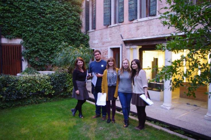
After handing in the short project, we headed to Venice for our first ever experience of the Biennial. It was a marvelous time and I felt like I am in an architecturally meritorious equivalent of Disneyland.
it wasn’t just seeing and engaging with the incredibly interesting approaches each country had to this year’s theme, set by Rem Koolhaas, “Absorbing Modernity”. Countries reflected on how their countries progressed over the past century and architecture’s role in delivering modernity.
There were a multitude of memorable moments and I took thousand of photos this weekend, so I’ll only share here some of the things that peaked my interest.
The Japanese pavilion focus on rebellious architecture that challenged the status quo – after all, this is one of the easiest ways to assure progress in society. However, the architecture on show wasn’t showcasing impractical conceptual ideas reminiscent of overambitious student projects, but celebrated ingenious real-life architecture. The exhibition was arranged a bit like a crowded studio, everything being easily accessible and giving you the satisfaction of discovering a gem of a drawing whilst looking through drawers and frames. Each piece seemed to summaries the architect’s individual outlook on modernity, but because the overall feel of the curated space was an industrial organised chaos, the experience wasn’t disjointed. I especially enjoyed the timeline of drawings hung in pull-out frames – it was refreshingly original and, as I had, it appeals to one’s curiosity and satisfaction of making a discovery.

The British pavilion focused on its housing estates, modernist – postwar. The actual building sits prominently on site and has a grand staircase approach, at the top of which tree trunks complemented the classical looking colonnade (I presume this was David Chipperfield’s contribution and a nudge to “Sticks and Stones”). There were many beloved and innovative (for their time) buildings mentioned, including Erno Goldfinger’s Trellick Tower in all its glory and memorabilia (half of which I own as well!). The central circular mound of earth, although at first confusing if one instantly thinks of a romantic curated English garden, was actually reminiscent of a housing estate built at the turn of the 20th century, the Boundary Estate. I wasn’t aware of its existence, but apparently it was one of the first social housing estates in Britain and the world, replacing a slum area. The ruins were piled up to create the raised landscaping feature, cleverly using the historical association of the mound as a burial, but celebratory element. The lineup of models, drawings, and pictures continued with the Thamesmead development, William Morris wallpaper, Hulme estate, a Glasgow development, Brunswick estate, and so on. It was glorious seeing the importance of housing for the many being recognised and raised to such heights.
Overall, a memorable experience which I hope to repeat every two years from now on! Thank you to Studio 3 and University of Liverpool for organising this amazing trip !


Leave a comment